The Studio
The Lerret studio is a desktop-first React app. It connects to a .lerret/
folder, scans the project model, renders every asset as an artboard on a
pan-and-zoom canvas, and watches the folder for changes. The same UI runs in all
three deploy modes.
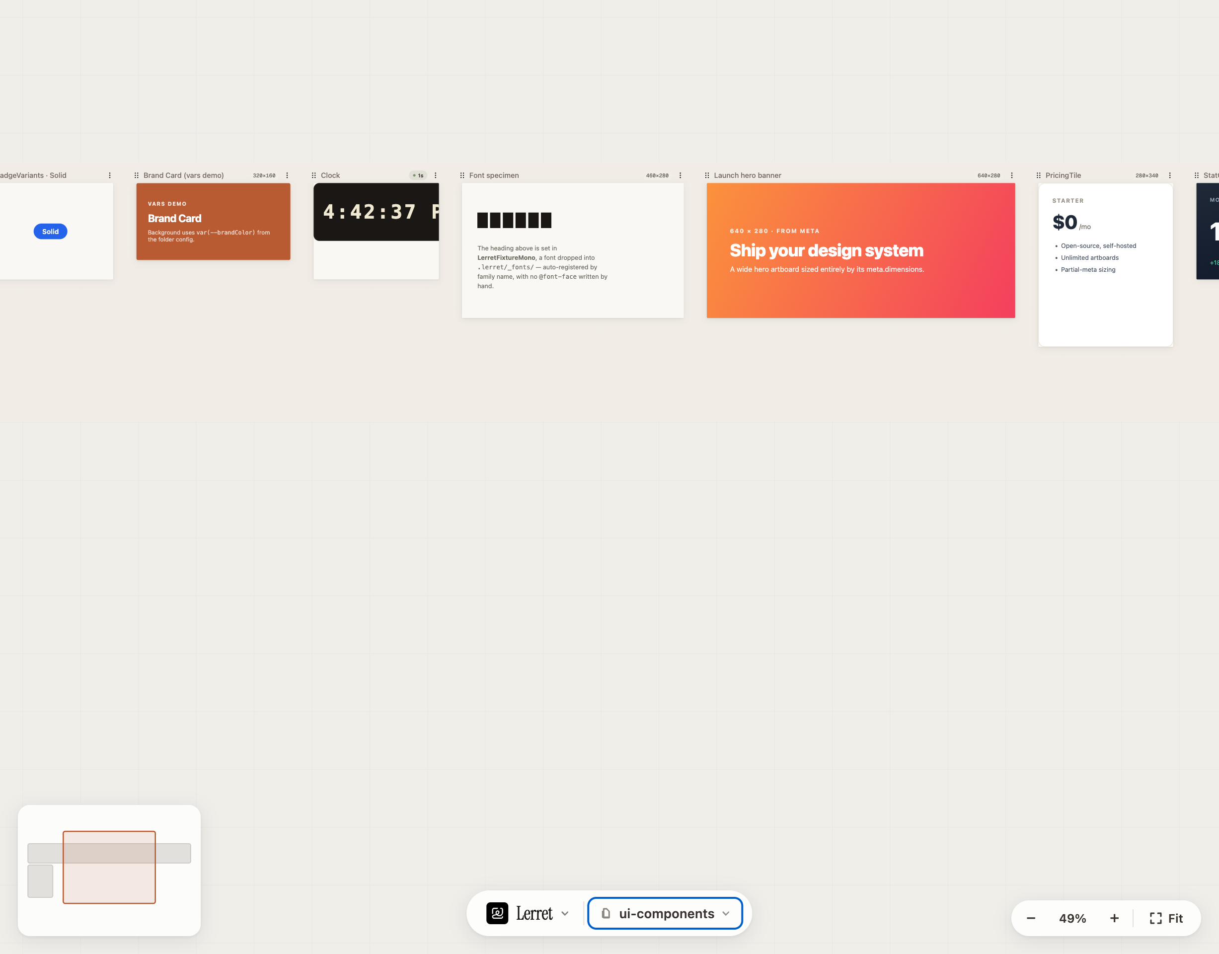
The screenshot above is the whole studio at a glance: the ui-components
page holding a row of artboards — badge variants, a vars-driven brand card, a
live clock, a font specimen, a hero banner, a pricing tile — with the dock
along the bottom and the mini-map and zoom controls in the corners.
Connecting a project
What you see first depends on the mode:
| Mode | First screen |
|---|---|
CLI (@lerret/cli dev <path>) | The canvas, with the resolved project loaded. |
| CLI (launched with no project) | The connect screen — paste a folder path or pick a recent project. |
| Hosted (browser) | The open-folder screen — one button that calls showDirectoryPicker(). |
In CLI mode the studio is a long-lived server you point at folders. With no project connected, the connect screen lets you open one without touching the terminal:
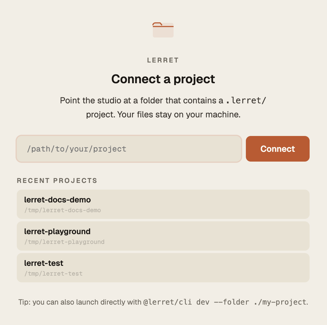
- Type or paste an absolute folder path and press Connect (the local CLI
walks up to find the
.lerret/). - Or click a Recent project to reopen it in one click — the list is remembered across sessions.
When you pick a folder that does not contain a .lerret/, you get a calm
inline “no project found” message, never a blank screen. In hosted mode the
first open of a folder shows a one-time trust acknowledgement before any of
your code runs (persisted in the browser, never written into your folder).
Already inside a project and want a different one? Use Switch project… in the brand menu — see Switching projects.
The canvas
Each asset becomes one or more artboards on a single infinite canvas, arranged to mirror the folder tree — pages at the top level, groups nested inside, assets inside those.
Each artboard:
- Renders at its declared
meta.dimensions(or a default size if absent). - Has its own error boundary — one broken artboard fails alone with an error card; the rest of the canvas keeps rendering.
- Updates in place when its file changes (see Live reload).
Getting around:
- Pan — drag the empty canvas, or middle-drag anywhere.
- Zoom — scroll/pinch, or the bottom-right controls:
−/+, the % readout (click to reset to 100%, or Shift+0), and Fit (frame everything, or Shift+1). - Mini-map — the overview in the bottom-left; click or drag it to jump anywhere, so you’re never lost in a large project.
Pages, groups & artboards
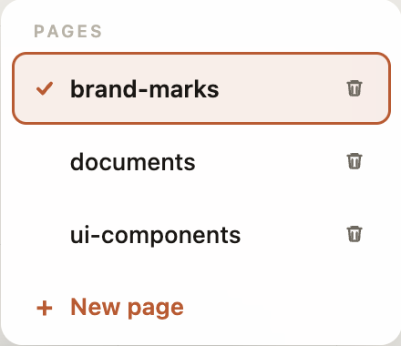
The folder tree is the structure. A top-level folder under .lerret/ is a
page; folders nested inside are groups; sub-groups nest visually inside
their parent’s frame. Switch between pages from the page picker in the dock:
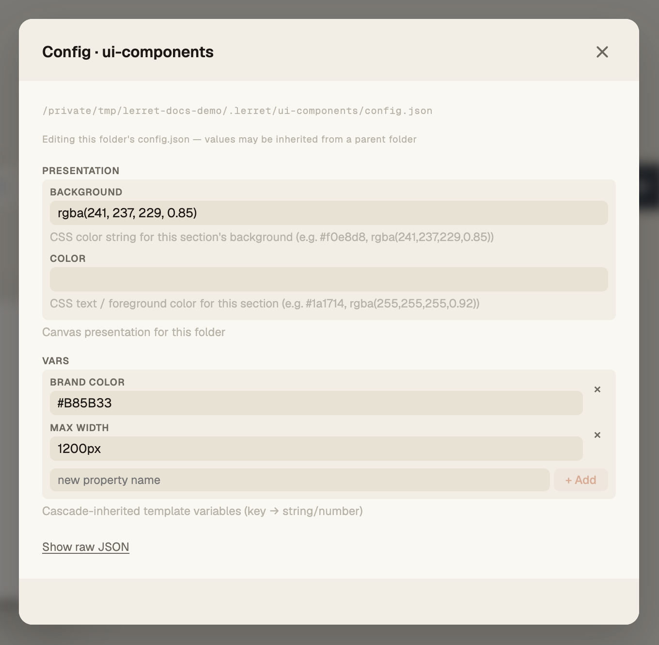
A group can set a presentation.background (and presentation.color) in its
config.json to tint its section, and expose custom vars — like the
--brandColor the Brand Card above reads. Pages, groups, and assets sort
alphabetically; prefix names like 01-intro, 02-pricing to control order,
or drag to reorder (below).
Variants — one file, many artboards
A component file becomes one artboard per component export: the default
export is the primary, and every additional named component export is its own
variant. meta is shared across them; a co-located data file supplies each
variant’s props by name.
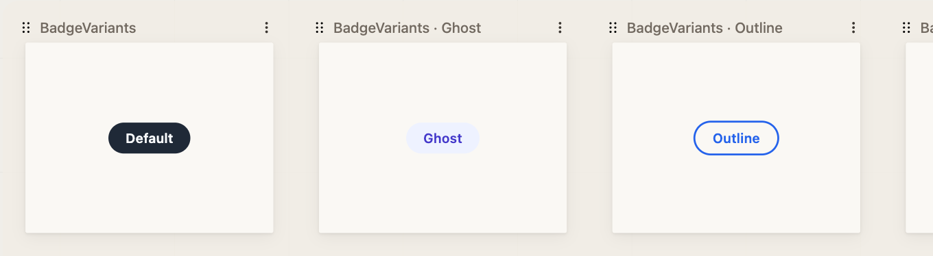
Here BadgeVariants.jsx exports default (Default) plus Ghost, Outline, and
Solid — four artboards from one file. Reach for named-export variants when
variants differ in structure, and data-file variants (same component,
different .data.json slice) when they differ only in content.
Reordering
- Artboards — grab the grip on an artboard’s label row and drag, or focus it and use ← / →.
- Top-level groups — grab a group’s grip to drag it into a new order on the page. Custom order is saved per page.
Creating pages, groups & assets
You can grow a project from inside the studio — never drop to the filesystem to add a folder or a first file. The create affordances live wherever your eye already is:
- New page — the page picker’s + New page (also offered on the empty connect/no-pages state).
- In a page or group — its ⋮ / right-click menu leads with Add asset… and Add group…; a page also shows + Add asset / + New group on the canvas.
- On the empty canvas — right-click and choose New group or New page (see Right-click menus).
Every path opens the same dialog — a name field with live validation and, for assets, a Component (.jsx) / Markdown (.md) toggle. Enter creates, Esc cancels.
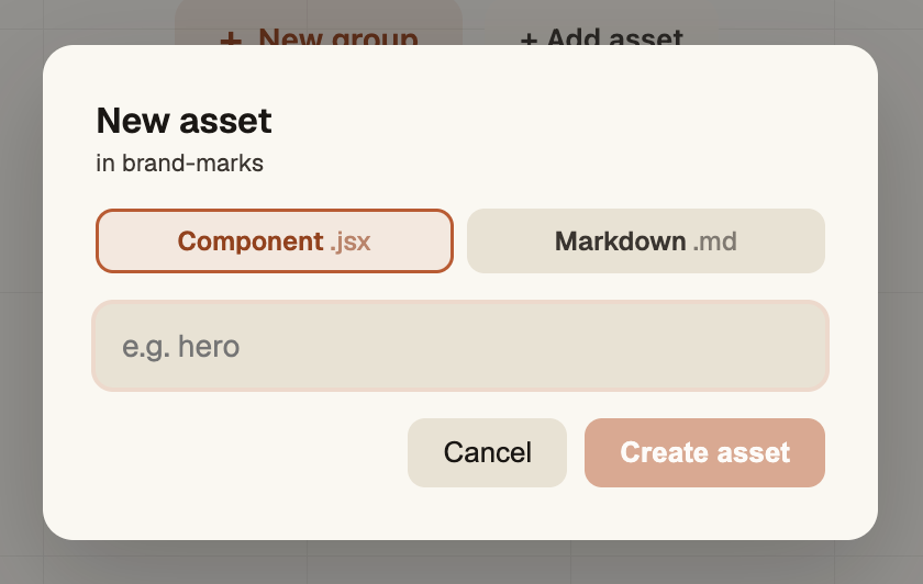
- Names validate as you type — empties, illegal characters, leading dots/ underscores, and OS-reserved names are refused with a calm hint.
- Collisions are caught instantly and case-insensitively (
Landingwon’t shadowlanding). - New components render immediately — a new
.jsxis seeded with a minimal valid component, so you get an artboard, not an error card.
A freshly-created empty group renders as a soft placeholder with a one-click + Add asset, so it’s visible and fillable rather than invisible:
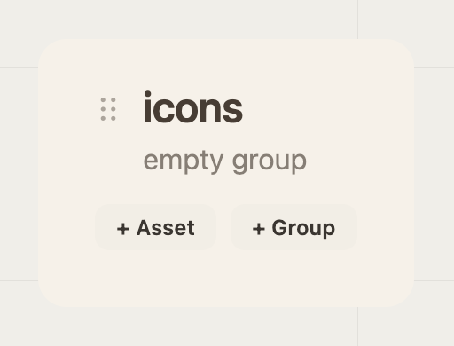
Creating writes to disk, so it runs in CLI mode (@lerret/cli dev).
Right-click context menus
Right-click anywhere on the canvas for a menu at your cursor. It’s a faster
path to the same actions the ⋮ kebab offers — nothing new to learn. Three
contexts, and the innermost target wins:
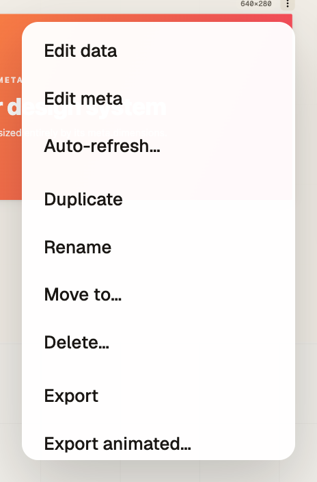
An artboard → its component or markdown actions:
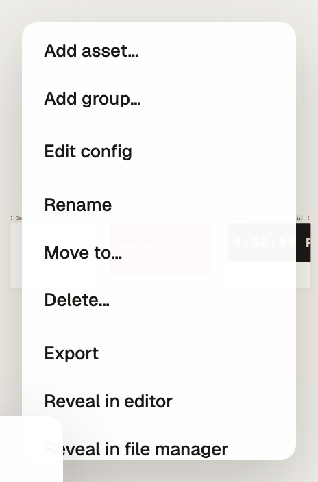
A group or page (its header / padding) → the section actions:
The empty canvas → create + navigation:
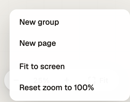
The menu is fully keyboard-operable (arrows, Enter, Esc), dismisses on click-away or scroll, and clamps to stay on-screen near edges. Destructive actions ask for confirmation inline.
Per-entity actions
Whether you open it from the ⋮ kebab or by right-clicking, each entity exposes the same set:
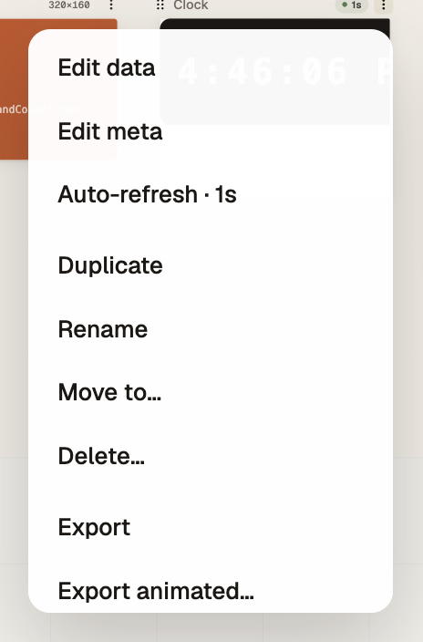
- Component artboard — Edit data · Edit meta · Duplicate · Rename · Move to… · Delete · Export (PNG/JPG, and animated when auto-refresh is configured) · Reveal in editor / file manager.
- Markdown card — Edit · Duplicate · Rename · Move to… · Delete · Export (PNG/JPG/PDF) · Reveal…
- Group / page — Add asset… · Add group… · Edit config · Rename · Move to… · Delete · Export · Reveal…
Reveal actions are CLI-only — they shell out to your OS, which the hosted File-System-Access sandbox can’t do, so they show disabled-with-reason there.
In-place editors
The studio includes typed editors for the on-disk artifacts behind an asset. Edits write back to the file — this is a true read-write tool.
| Editor | Edits | File written |
|---|---|---|
| Data editor | An asset’s props | <Name>.data.json |
| Config editor | A folder’s settings | The folder’s config.json |
| Meta editor | An asset’s meta (label, tags, dimensions) | The asset source file |
| Markdown editor | A .md asset’s raw text | The .md file |
The data editor is schema-driven: when an asset declares meta.propsSchema,
it generates a typed form (text, boolean, select, …); without a schema it falls
back to free-form key/value editing.
Dimensions are also one click away without opening the meta editor: the size chip on an artboard’s label row opens a preset picker — 1:1 (1080×1080), 4:5 (1080×1350), 9:16 (1080×1920), 16:9 (1920×1080), OG (1200×630), or a custom width × height.
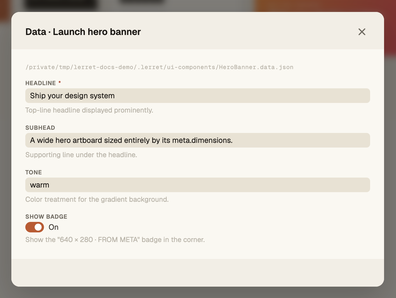
The config editor edits a folder’s presentation (background / foreground
color) and custom vars, with a + to add your own properties:
The markdown editor shows Source and Preview side by side — author the raw text on the left and watch it render live on the right (the same renderer the card uses). Writes are debounced as you type, so dismissing the sheet never loses work:
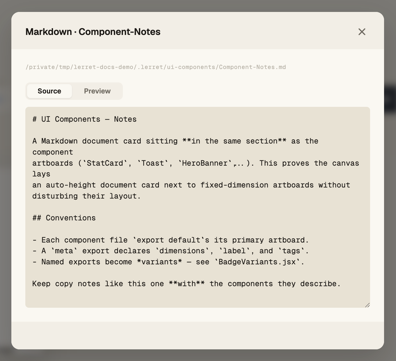
Edits flow through the same four-tier prop resolution that drives rendering, so the editor and the canvas always agree.
Validation
When an asset declares meta.propsSchema with required fields or constrained
types, the studio validates every artboard render. Failures surface as a
small ⚠️ badge on the artboard’s label row — non-blocking; the artboard
still renders. Click the badge to jump straight into the data editor with the
offending field focused
(“click to fix”). Validation is lenient by design — Lerret always tries to
render; the badge is a hint, not a gate.
Moving things
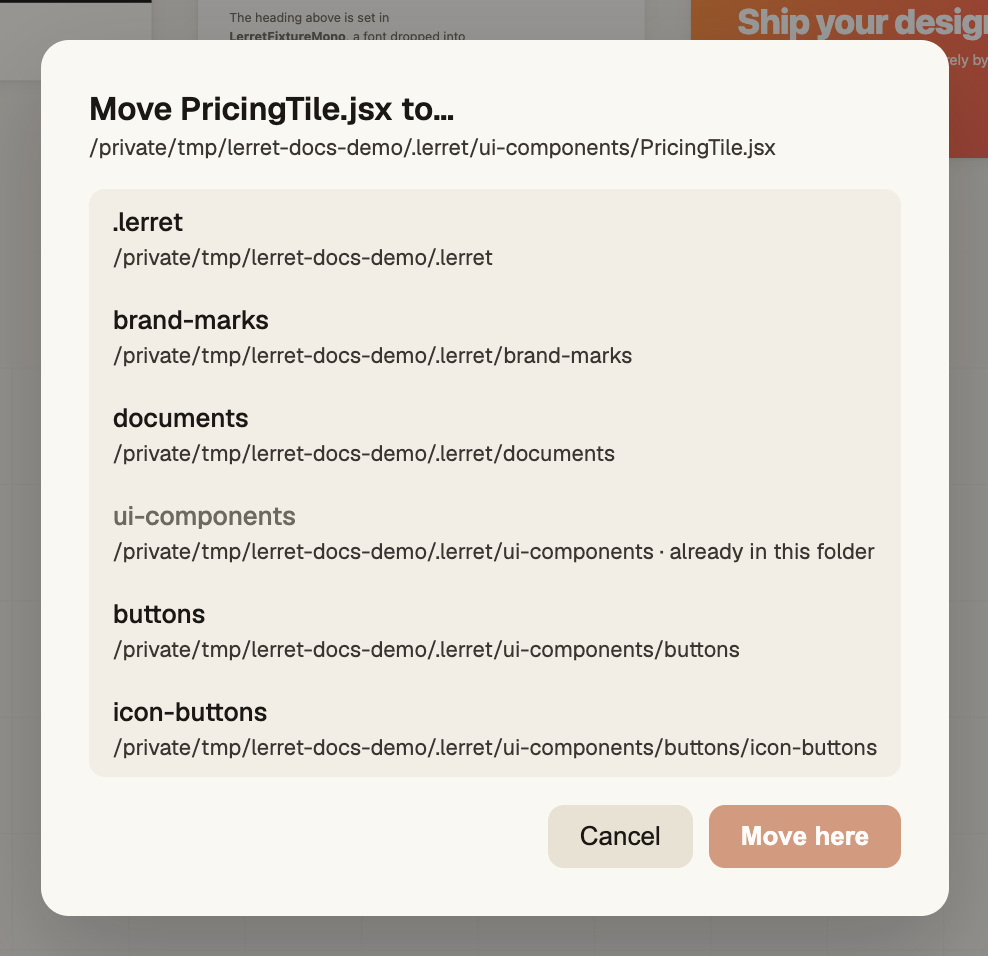
Move to… opens a picker of every folder in the project; choose a destination and the studio reparents the file (and its companions — data file, config file, prefixed images) atomically, so its auto-refresh setting travels with it.
Export from the studio
Three scopes:
| Scope | What it captures |
|---|---|
| Single artboard | One artboard → one image (the artboard’s ↓ PNG / ↓ JPG, or its menu’s Export). Markdown cards additionally offer ↓ PDF. |
| Page or group | Every artboard in that branch (the section’s Export, with a PNG/JPG × structured/flat picker). |
| Whole project | Every artboard → one structured ZIP (the brand menu’s Export ZIP). |
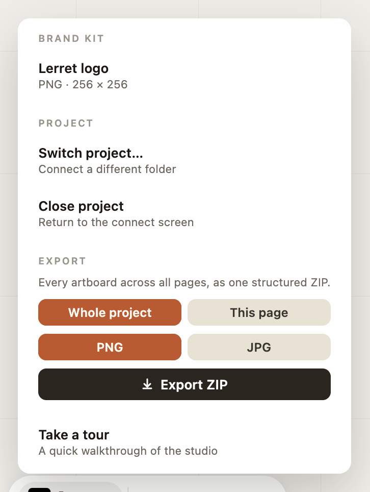
The whole-project panel lives in the brand menu (the Lerret lockup at the
left end of the dock), where you choose scope (whole project / this page),
format (PNG/JPG), and run the export:
Studio exports use the exact same captureArtboard as @lerret/cli export
(the CLI runs it in a headless Chromium), so output is pixel-faithful between the
two — use either interchangeably.
Live reload
A file change on disk re-renders the affected artboard in well under a second.
- CLI mode — chokidar watches your
.lerret/and emits change events; the studio cache-busts and re-imports the changed module in place. - Hosted / self-host — directory-handle polling produces the same normalized events; the in-browser transformer rebuilds the module.
Both backends emit identical { type, path } events into the same incremental
model patcher in @lerret/core, so add / remove / rename of files and folders
show up on the canvas — no full reload, no lost viewport.
Auto-refresh
Live reload reacts to file changes. Some assets need to re-render on a timer instead — a clock, a countdown, a live counter — even when nothing on disk changed. Auto-refresh is a per-asset interval that re-renders just that one artboard on a clock.
Set it on the artboard: open a component’s kebab (or right-click it) and choose Auto-refresh.
Pick a preset — Off · 0.5s · 1s · 2s · 5s — or Custom… for any value down
to a single frame. There’s no asset name to type and no milliseconds to reason
about.
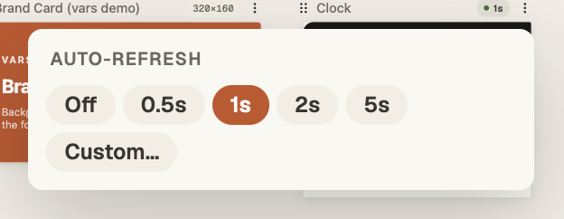
While it’s on, a small ● 1s badge sits in the artboard’s label row — your cue that the asset is live, and a one-click shortcut back to the picker. Only component assets can auto-refresh, and that same badge is what unlocks the animated export button.
Under the hood it’s a <Name>.config.json file sitting next to the asset, holding
{ "autoRefresh": <ms> }. The picker writes it for you — one file per asset, so
each asset carries its own rhythm with no folder-level map and no cascade. Full
reference: Auto-refresh in Concepts.
Switching projects
In CLI mode you can re-point the studio at a different folder without restarting the CLI. Open the brand menu and choose Switch project…:
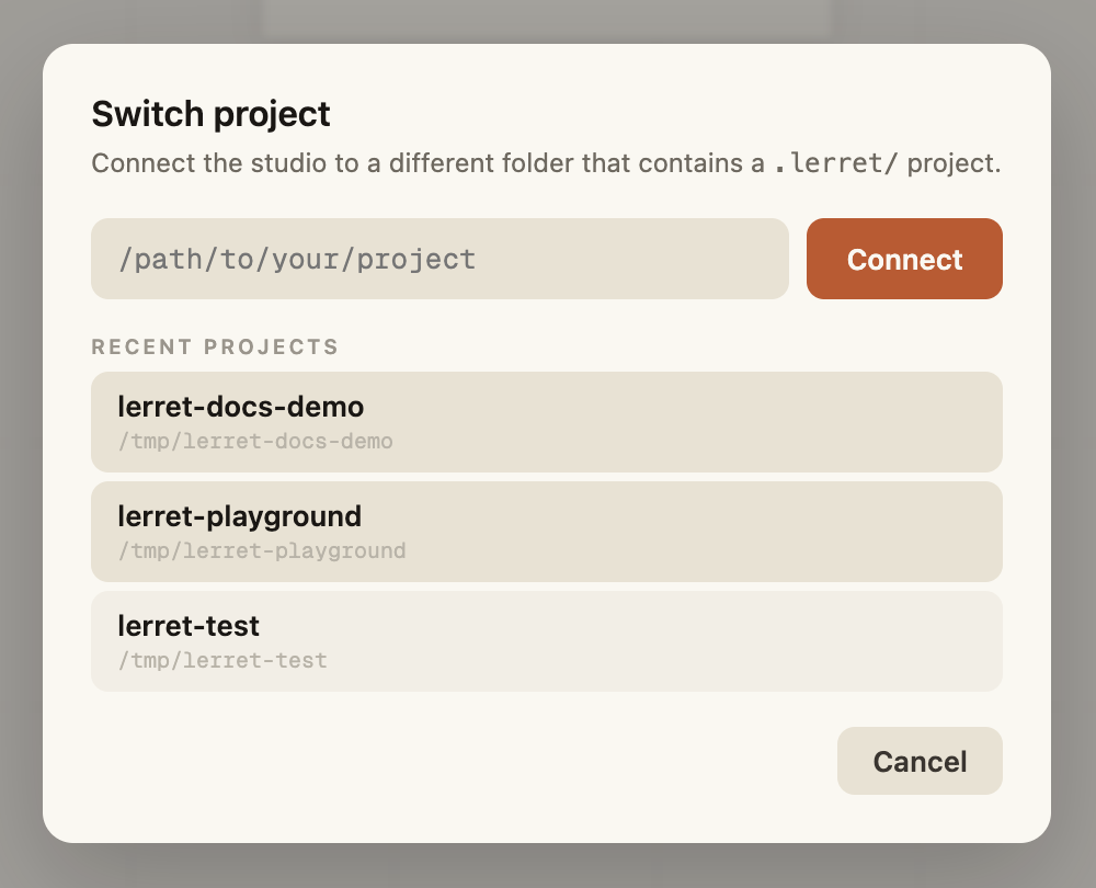
Paste a path or pick a recent — the canvas swaps to the new project with no page reload (your work auto-saves continuously, so there’s nothing to lose). Close project returns you to the connect screen.
Focus mode
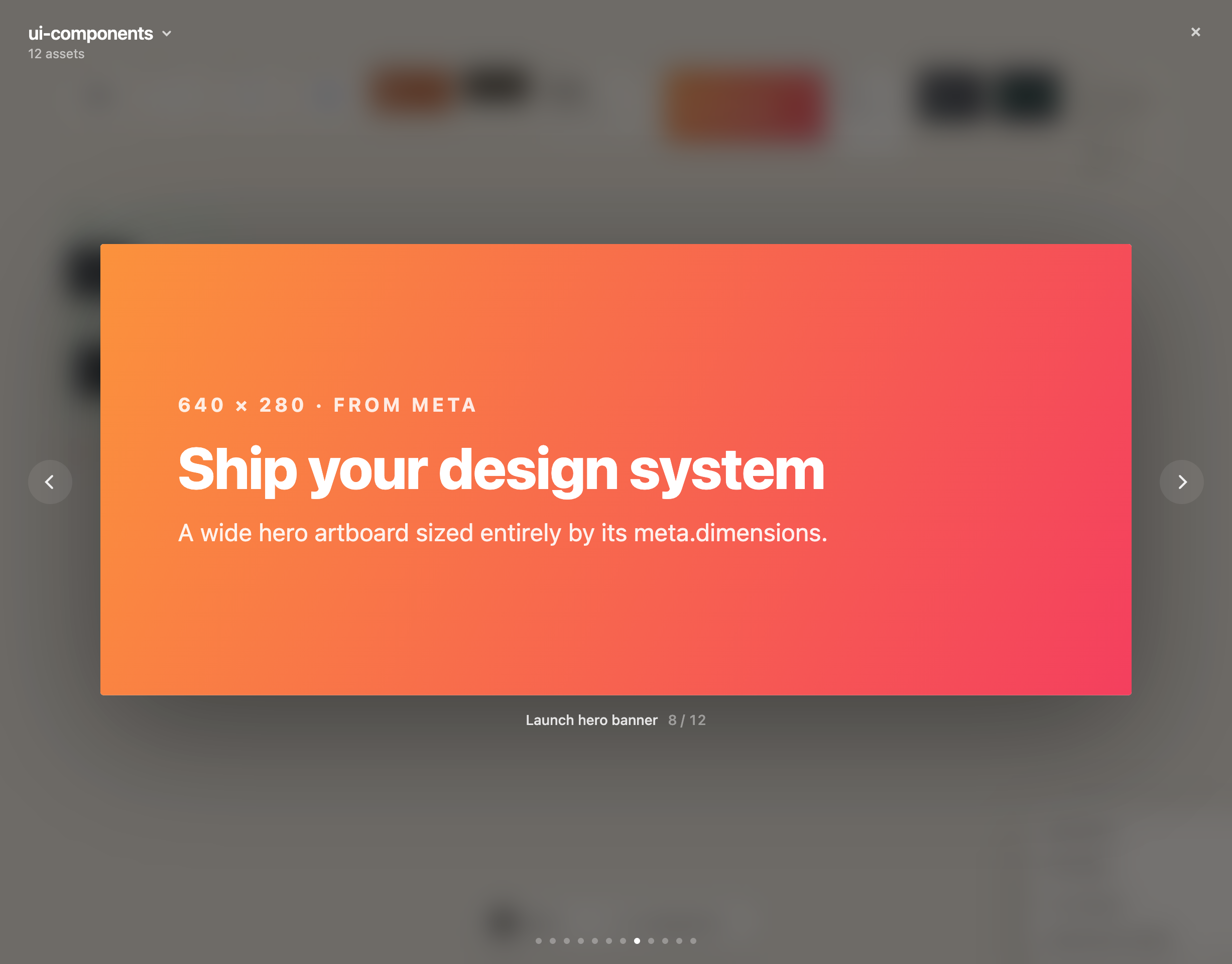
Focus mode shows a single artboard fullscreen with the rest of the canvas dimmed — for precision work, a clean screenshot, or reviewing at exact pixel dimensions. Open it from an artboard’s expand control; ← / → move between artboards and Esc exits.
Design and edit with AI
The dock also holds Lerret’s built-in AI agent. Between the page picker and
export is a single input — Ask Lerret to design or edit… — that prompts a
brand-aware agent to read, write, and restructure the files in your .lerret/
folder for you. It runs against your own provider key (OpenAI, Anthropic,
OpenRouter) or a fully-local Ollama, calls the provider browser-direct with
no Lerret backend in the path, and snapshots every turn so any edit is one click
to revert.
Full guide: AI in the Studio.
Keyboard & mouse
The studio is a desktop application — mouse + keyboard. Handy shortcuts:
| Action | Shortcut |
|---|---|
| Fit everything to screen | Shift+1 |
| Reset zoom to 100% | Shift+0 |
| Open any entity’s menu | Right-click the artboard / group / canvas |
| Move a focused artboard | ← / → |
| Confirm / cancel a dialog | Enter / Esc |
Mobile, touch, and responsive layouts are out of scope; the hard platform constraint is browser support (File System Access API → Chromium-only for hosted/self-host).
What’s next
- AI in the Studio — the built-in brand-aware agent in the dock.
- Authoring Assets — components, schemas, data files, fonts.
- CLI Reference —
@lerret/cli devand@lerret/cli export. - Deployment — the three deploy modes in detail.