Examples
You shipped the product. Now you need an App Store screenshot, a Product Hunt gallery image with your UI in a phone frame, a “X is live” launch poster, a feature-drop graphic for Twitter. Designers know this drill; most builders don’t. This is the gap. Sixteen art-directed marketing posters below — each a complete Lerret asset you can drop in, edit, and export.
The first three are the mockup-based ones (phone, multi-device, App Store screenshot) — the assets devs and indie founders ask “how do I make one of these” most often. The rest cover the announcement / milestone / community surface.
The previews on this page were rendered with Lerret. Every image below is the output of
@lerret/cli exportagainst the source shown next to it — including the iPhone and laptop frames, drawn as plain CSS.
Where to put the files. Inside your project’s
.lerret/folder, put each.jsxunder a page folder (e.g..lerret/marketing/phone-hero.jsx). Co-located data files live alongside.
1. Phone hero — App on iPhone showcase
Use case. The “look at my app on a phone” hero — for landing pages, Twitter launch posts, App Store landing pages. iPhone-15-style frame drawn entirely in CSS (rounded bezel, dynamic island, status bar) with a mock canvas inside showing three artboard cards. Headline copy + tagline beside it. Portrait 1200×1500.
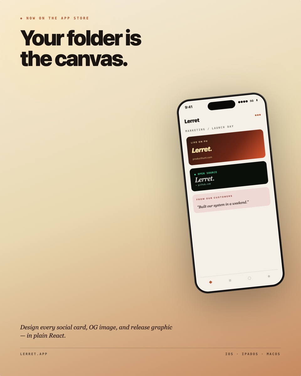
Path. .lerret/marketing/phone-hero.jsx
export const meta = {
  dimensions: { width: 1200, height: 1500 },
  label: 'Phone-hero — app showcase',
  tags: ['poster', 'mockup', 'app-showcase', 'launch'],
  propsSchema: {
    eyebrow: { type: 'string', default: 'NOW ON THE APP STORE' },
    headline: { type: 'string', default: 'Your folder is\nthe canvas.', required: true },
    tagline: { type: 'string', default: 'Design every social card, OG image, and release graphic — in plain React.' },
    appName: { type: 'string', default: 'Lerret' },
  },
};

// Full source: ~300 lines (includes a reusable PhoneFrame + MockApp).
// Both helpers are local — they ARE the design.
Design notes. The whole iPhone is built in CSS — outer titanium gradient bezel, inner glossy ring, screen, dynamic island, status bar with time + signal indicators. The mock app inside renders three “artboard” cards (the same patterns the user might author in Lerret), so the poster recursively shows the product. PhoneFrame and MockApp are kept as local helpers in the file so the asset stays self-contained — you can swap the mock-app body for your own.
2. App Store screenshot — feature highlight
Use case. The 1290×2796 portrait screenshot you upload to App Store Connect / Play Console — there are usually 5–10 per app, each highlighting one feature. This pattern: big headline at the top, italic-serif subhead, large phone frame anchored to the bottom-center with a mock editor view inside. Tall portrait 1080×1920 (Instagram-story / App Store screenshot ratio).
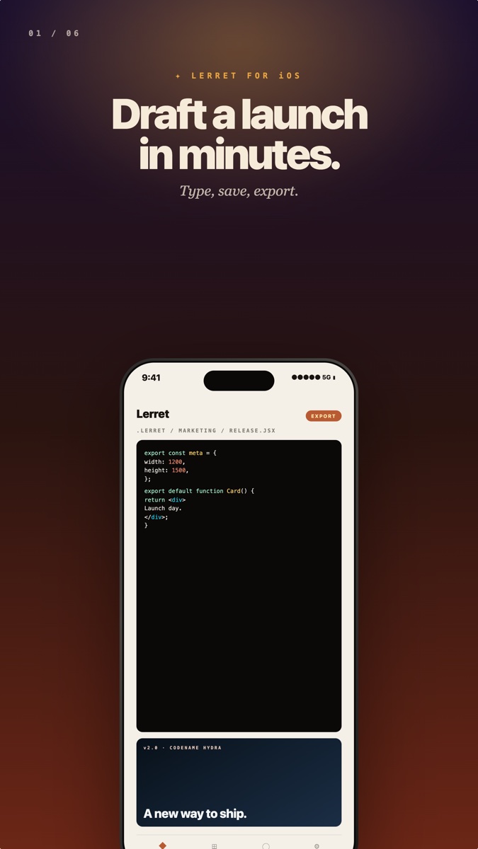
Path. .lerret/marketing/app-store-screenshot.jsx
export const meta = {
  dimensions: { width: 1080, height: 1920 },
  label: 'App Store screenshot — feature highlight',
  tags: ['poster', 'mockup', 'app-store', 'screenshot'],
  propsSchema: {
    page: { type: 'string', default: '01 / 06' },
    headline: { type: 'string', default: 'Draft a launch\nin minutes.', required: true },
    subhead: { type: 'string', default: 'Type, save, export.' },
    appName: { type: 'string', default: 'Lerret' },
  },
};

// Full source ~270 lines. PhoneFrame + MockEditor inside.
Design notes. App Store screenshots are essentially one big marketing claim + one phone frame. The phone is anchored bottom-center with bottom: -60 so the device extends past the canvas — that “spilling out of the page” treatment is the convention you see across the Apple ecosystem screenshot examples. Inside the frame is a mock code editor (mono syntax) followed by a preview-card thumbnail — that combination of “code → preview” shows what the app actually does without faking screenshots. Build five or six of these for an app launch, swap headlines + page number.
3. Multi-device showcase — phone + laptop
Use case. “Available everywhere” promo for cross-platform apps. Landscape 1600×1000, dark cosmic background, a laptop frame on the right with a mock canvas grid showing six artboards, and a tilted iPhone in the bottom-left overlapping the laptop. Headline + tagline on the left.
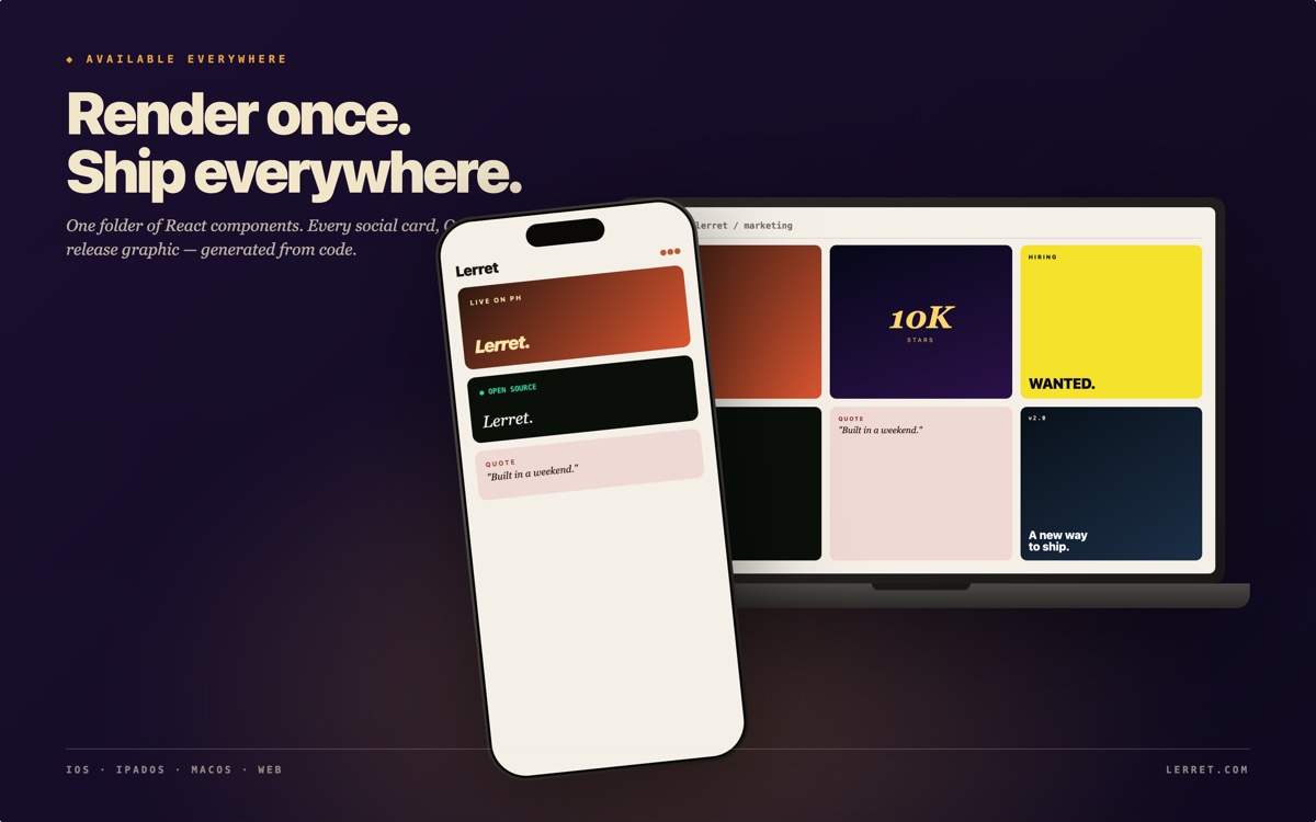
Path. .lerret/marketing/multi-device.jsx
export const meta = {
  dimensions: { width: 1600, height: 1000 },
  label: 'Multi-device — phone + laptop showcase',
  tags: ['poster', 'mockup', 'multi-device', 'launch'],
  propsSchema: {
    eyebrow: { type: 'string', default: 'AVAILABLE EVERYWHERE' },
    headline: { type: 'string', default: 'Render once. Ship everywhere.', required: true },
    tagline: { type: 'string', default: 'One folder of React components. Every social card, OG image, app screenshot, and release graphic — generated from code.' },
    appName: { type: 'string', default: 'Lerret' },
  },
};

// Full source ~400 lines. PhoneFrame, LaptopFrame, MockPhoneCanvas,
// MockLaptopCanvas — all local helpers.
Design notes. The laptop frame is also pure CSS: a tilted-trapezoid base + rounded screen with traffic-light dots and a faux toolbar. The 3×2 bento inside the laptop shows the breadth of what Lerret renders — using the same patterns the other examples in this gallery teach (PH launch, stars milestone, OSS release, hiring, testimonial, release card). The phone overlaps the laptop’s bottom-left corner like an iOS marketing shot. Restraint: no shadow under the devices that’s so dark it looks fake; the natural drop-shadow from filter: drop-shadow(...) is enough.
4. Product Hunt gallery image — feature card
Use case. The 1270×760 gallery images on a Product Hunt listing page. Each one highlights one feature with a strong value prop. Split layout: text column on the left, a hero-number panel on the right. 1270×760 landscape.
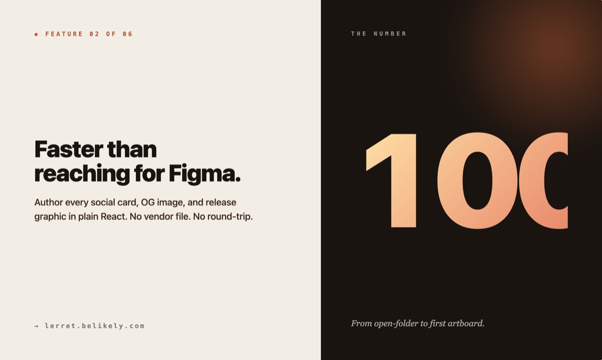
Path. .lerret/marketing/ph-gallery.jsx
export const meta = {
  dimensions: { width: 1270, height: 760 },
  label: 'Product Hunt gallery image',
  tags: ['poster', 'product-hunt', 'feature-card'],
  propsSchema: {
    eyebrow: { type: 'string', default: 'Feature 02 of 06' },
    metric: { type: 'string', default: '100×' },
    headline: { type: 'string', default: 'Faster than reaching for Figma.', required: true },
    description: { type: 'string', default: 'Author every social card, OG image, and release graphic in plain React.' },
    detail: { type: 'string', default: 'lerret.belikely.com' },
  },
};

// Full source — see the fixture file in the docs repo.
Design notes. The split layout (60/40) is the PH-gallery convention — readers scan the left for the claim, scan the right for the proof. The right panel inverts the palette so the metric reads as quotable and the whole image holds together as a single object.
5. Product Hunt launch — tour poster
Use case. The card you ship the morning you launch. Treats the moment like a printed handbill: serif italic product name as the centerpiece, condensed sans callout in PH orange, a hairline frame, tour-style date strip. Portrait 1200×1500.
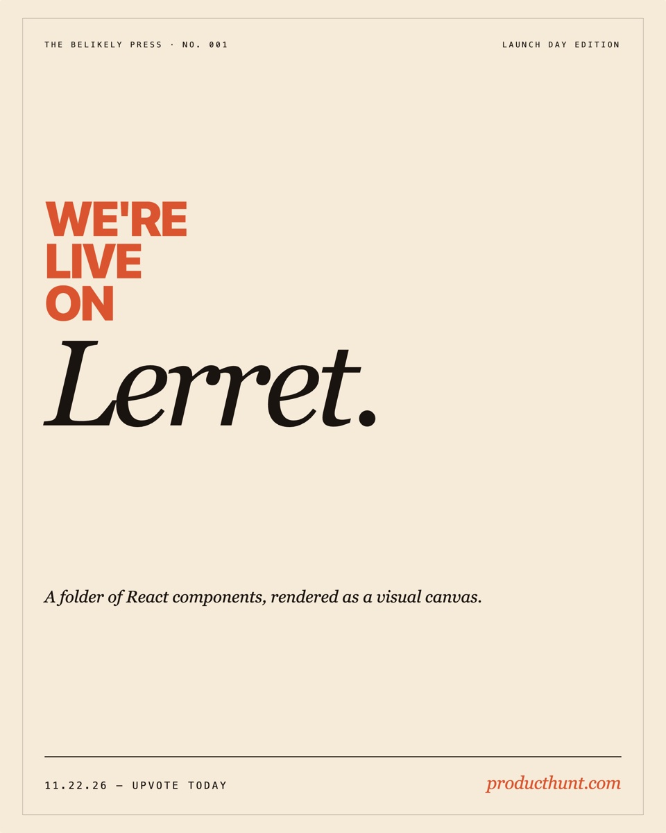
Path. .lerret/marketing/product-hunt.jsx
export const meta = {
  dimensions: { width: 1200, height: 1500 },
  label: 'Product Hunt — launch poster',
  tags: ['poster', 'product-hunt', 'launch'],
  propsSchema: {
    productName: { type: 'string', default: 'Lerret', required: true },
    tagline: { type: 'string', default: 'A folder of React components, rendered as a visual canvas.' },
    launchDate: { type: 'string', default: '11.22.26' },
    issue: { type: 'string', default: 'NO. 001' },
  },
};

// Full source — see the fixture file in the docs repo.
Design notes. No pills, no buttons, no avatars — just a masthead, a stacked callout, the product name as the visual centerpiece, and a tour-style date strip.
6. Feature launch — typography poster
Use case. “Introducing X” treated as art-directed type, not a UI announcement. Cream top, cherry-red bottom band, the feature name centered in display-weight lowercase, a rotated ghosted “new” echo nestled below it. Portrait 1200×1500.
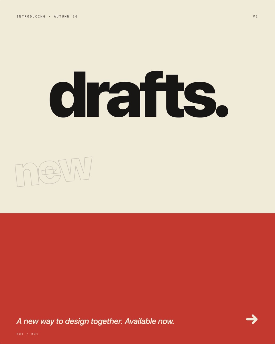
Path. .lerret/marketing/feature-launch.jsx
export const meta = {
  dimensions: { width: 1200, height: 1500 },
  label: 'Feature launch — typography poster',
  tags: ['poster', 'announcement', 'feature'],
  propsSchema: {
    feature: { type: 'string', default: 'Drafts', required: true },
    version: { type: 'string', default: 'V2' },
    issueDate: { type: 'string', default: 'AUTUMN 26' },
    footnote: { type: 'string', default: 'A new way to design together. Available now.' },
  },
};

// Full source — see the fixture file in the docs repo.
Design notes. Type-as-image — the feature word IS the design. Sized at 280px so it fits cleanly inside the canvas with breathing room either side, while the outlined “new” echo nested below-left at 180px / −6° gives the print-shop / risograph energy. The cherry-red band at the bottom is a flat color block, not a gradient — that’s the screen-print signal.
7. Open source release — terminal aesthetic
Use case. The “we just open sourced X” announcement — a launch shape that’s reliably catnip on dev Twitter and HN. Mono ledger top and bottom, $ git clone prompt, terminal-grid subtle pattern, green ”● running” status indicator. Italic serif project name as the centerpiece. Landscape 1200×800.
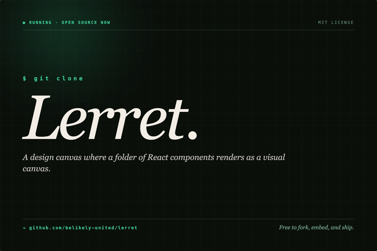
Path. .lerret/marketing/open-source.jsx
export const meta = {
  dimensions: { width: 1200, height: 800 },
  label: 'Open source release',
  tags: ['poster', 'open-source', 'announcement'],
  propsSchema: {
    project: { type: 'string', default: 'Lerret', required: true },
    description: { type: 'string', default: 'A design canvas where a folder of React components renders as a visual canvas.' },
    repo: { type: 'string', default: 'github.com/belikely-united/lerret' },
    licence: { type: 'string', default: 'MIT' },
    note: { type: 'string', default: 'Free to fork, embed, and ship.' },
  },
};

// Full source — see the fixture file in the docs repo.
Design notes. Mixing serif and mono is the trick: pure monospace would feel like a literal terminal screenshot, pure serif would lose the dev signal. The Georgia italic project name sits inside the terminal scaffolding — green prompt above, repo URL below.
8. Release / version announcement — Swiss modernist
Use case. Version release, treated as a Bauhaus / Swiss-design poster. Off-white background, olive vertical color strip on the left, massive stacked version number, italic serif codename, headline, ledger-style “what’s new” rows with numbered indices. Portrait 1200×1500.
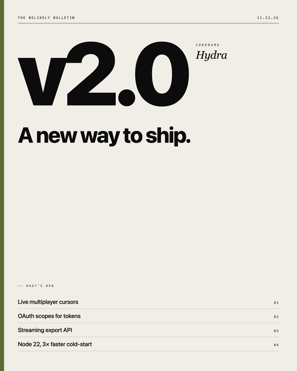
Path. .lerret/marketing/release-card.jsx
export const meta = {
  dimensions: { width: 1200, height: 1500 },
  label: 'Release — Swiss modernist poster',
  tags: ['poster', 'release', 'announcement'],
  propsSchema: {
    version: { type: 'string', default: '2.0', required: true },
    codename: { type: 'string', default: 'Hydra' },
    headline: { type: 'string', default: 'A new way to ship.' },
    note1: { type: 'string', default: 'Live multiplayer cursors' },
    note2: { type: 'string', default: 'OAuth scopes for tokens' },
    note3: { type: 'string', default: 'Streaming export API' },
    note4: { type: 'string', default: 'Node 22, 3× faster cold-start' },
    date: { type: 'string', default: '11.22.26' },
  },
};

// Full source — see the fixture file in the docs repo.
Design notes. The single olive accent stripe + numbered ledger rows are pure Swiss modernist conventions (Müller-Brockmann posters, Wim Crouwel grids). Each note row is a border-bottom ledger line with the index in monospace olive on the right.
9. Stars milestone — constellation poster
Use case. Open-source milestone celebrations. Deep midnight blue, scattered glowing star dots, a giant italic-serif number as the only loud element, vertical “STARS · STARS · STARS” running text on the side. Square 1080×1080.
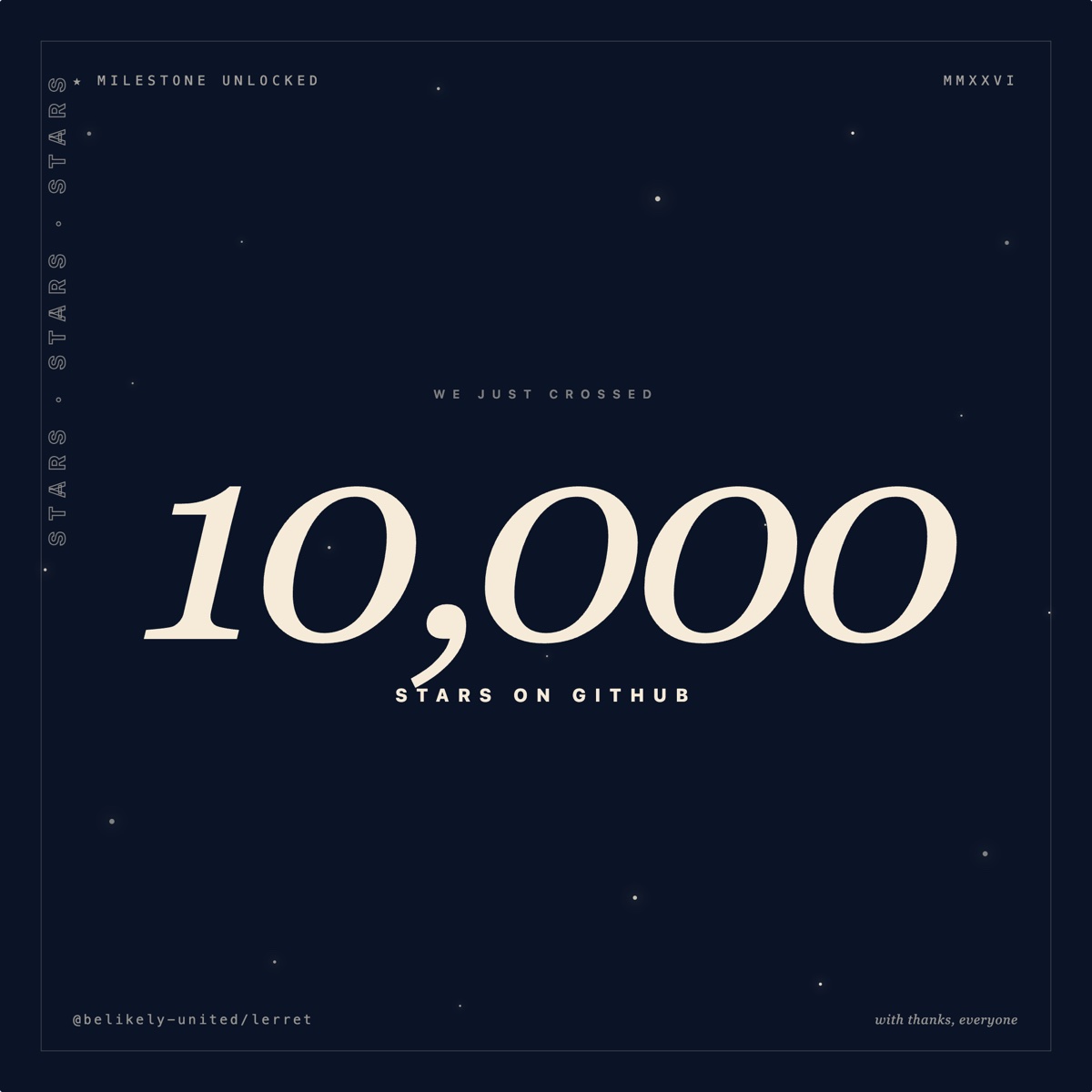
Path. .lerret/marketing/stars-milestone.jsx
export const meta = {
  dimensions: { width: 1080, height: 1080 },
  label: 'Stars milestone — constellation poster',
  tags: ['poster', 'milestone', 'github'],
  propsSchema: {
    count: { type: 'string', default: '10,000' },
    label: { type: 'string', default: 'STARS' },
    handle: { type: 'string', default: '@belikely-united/lerret' },
    note: { type: 'string', default: 'with thanks, everyone' },
  },
};

// Full source — see the fixture file in the docs repo.
Design notes. The italic serif number is doing the heavy lifting — it reads as poetry, not a metric. Vertical rotated text with -webkit-text-stroke gives the side-spine pattern from book covers and movie posters.
10. LinkedIn announcement post
Use case. B2B-flavoured milestone announcement — funding round, acquisition, hire, year-end recap. Restrained palette (cream linen + navy + lighter steel-blue), italic serif eyebrow + huge tabular-numeral figure + multi-sentence body. Landscape 1200×627 — LinkedIn’s native post dimensions.
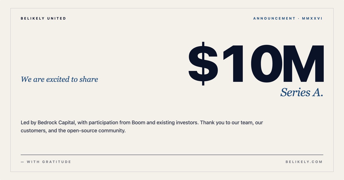
Path. .lerret/marketing/linkedin-announcement.jsx
export const meta = {
  dimensions: { width: 1200, height: 627 },
  label: 'LinkedIn announcement post',
  tags: ['poster', 'linkedin', 'announcement'],
  propsSchema: {
    eyebrow: { type: 'string', default: 'We are excited to share' },
    figure: { type: 'string', default: '$10M', required: true },
    label: { type: 'string', default: 'Series A' },
    body: { type: 'string', default: 'Led by Bedrock Capital, with participation from existing investors...' },
    company: { type: 'string', default: 'BELIKELY UNITED' },
  },
};

// Full source — see the fixture file in the docs repo.
Design notes. Tabular numerals on the figure (always tabular for financial / quantity figures — they line up reading right-to-left). The hairline frame keeps the composition reading as “a printed announcement” rather than “a digital banner.”
11. We’re hiring — brutalist poster
Use case. Job-post graphic with the energy of a punk-zine flyer. Electric yellow canvas, outlined “WANTED.” filling the top half, diagonal red “APPLY NOW” stamp with a chunky offset shadow, role name in display caps, perks as a thick-bordered ledger. Portrait 1080×1350.
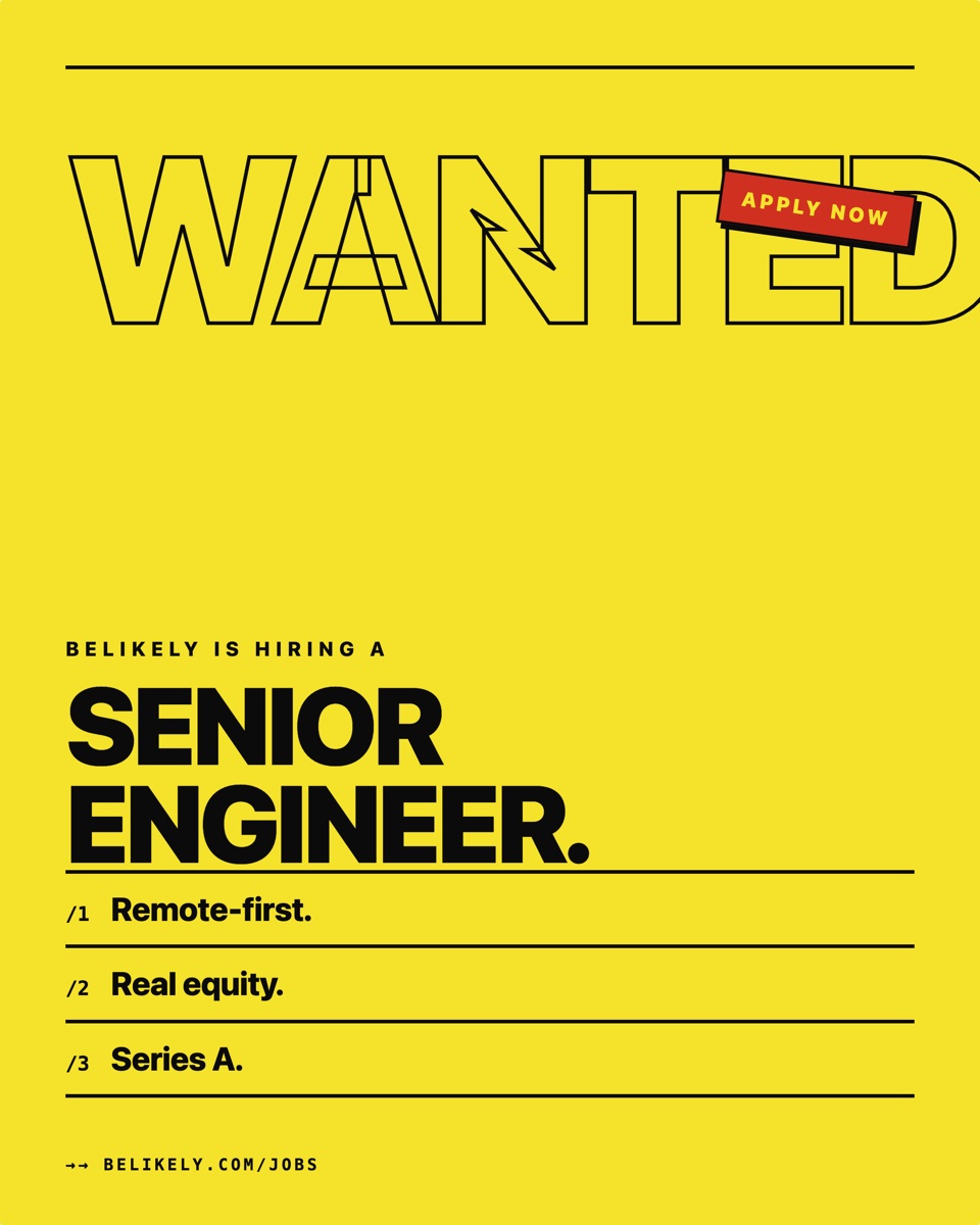
Path. .lerret/marketing/hiring.jsx
export const meta = {
  dimensions: { width: 1080, height: 1350 },
  label: 'Hiring — brutalist poster',
  tags: ['poster', 'hiring', 'careers'],
  propsSchema: {
    role: { type: 'string', default: 'Senior Engineer', required: true },
    company: { type: 'string', default: 'Belikely' },
    perk1: { type: 'string', default: 'Remote-first' },
    perk2: { type: 'string', default: 'Real equity' },
    perk3: { type: 'string', default: 'Series A' },
    url: { type: 'string', default: 'belikely.com/jobs' },
  },
};

// Full source — see the fixture file in the docs repo.
Design notes. The brutalist signal is the outlined “WANTED.” (-webkit-text-stroke: 4px), the diagonal transform: rotate(8deg) red stamp with a 6px offset shadow, and the thick 4px solid ledger lines on the perks.
12. Conference talk — marquee poster
Use case. Conference-talk announcement borrowing tour-poster vocabulary, with the talk title as the headliner. Speaker plays the supporting “performer” role below a marquee divider. Deep midnight purple with a sunset radial glow anchored bottom-center. Portrait 1200×1500.
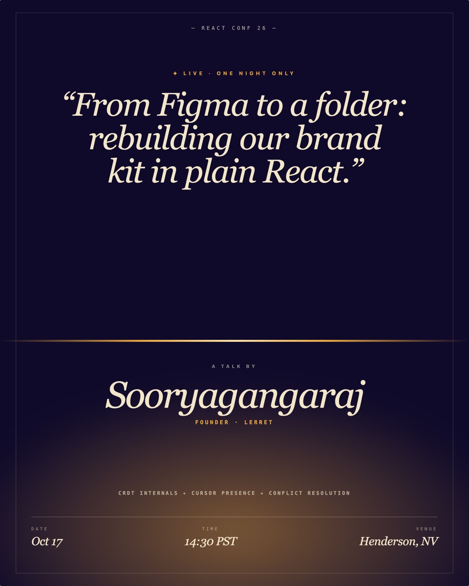
Path. .lerret/marketing/talk-promo.jsx
export const meta = {
  dimensions: { width: 1200, height: 1500 },
  label: 'Talk promo — marquee poster',
  tags: ['poster', 'talk', 'conference'],
  propsSchema: {
    conference: { type: 'string', default: 'React Conf 26' },
    talkTitle: { type: 'string', default: 'From Figma to a folder: rebuilding our brand kit in plain React.', required: true },
    speaker: { type: 'string', default: 'Sooryagangaraj' },
    role: { type: 'string', default: 'Founder · Lerret' },
    date: { type: 'string', default: 'Oct 17' },
    time: { type: 'string', default: '14:30 PST' },
    venue: { type: 'string', default: 'Henderson, NV' },
    topic1: { type: 'string', default: 'CRDT internals' },
    topic2: { type: 'string', default: 'Cursor presence' },
    topic3: { type: 'string', default: 'Conflict resolution' },
  },
};

// Full source — see the fixture file in the docs repo.
Design notes. Talk title is the hero (84px italic serif, in quotes) — that’s what actually sells a talk. Speaker treated as the “performer” credit below a horizontal amber marquee gradient line (the “stage”). Topics joined with ✦ in mono caps borrow from gig-flyer “with opening acts” patterns.
13. Testimonial — magazine cover
Use case. Customer quote treated as a magazine cover line. Dusty pink, big masthead “The Customer Quarterly,” issue number as an oversized outlined decoration, giant italic serif pull-quote, byline at the bottom like a contributor credit. Portrait 1080×1350.
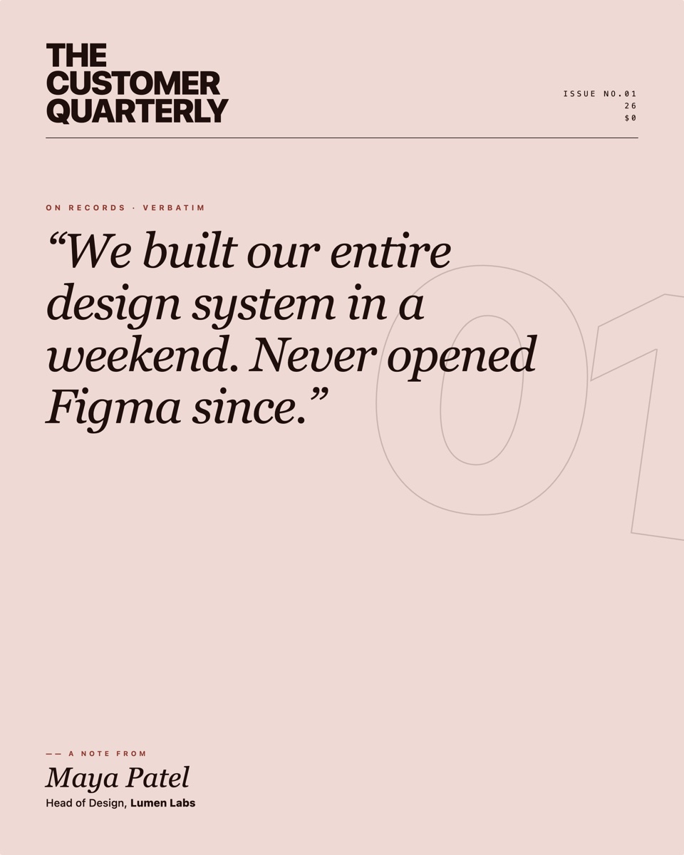
Path. .lerret/marketing/testimonial.jsx
export const meta = {
  dimensions: { width: 1080, height: 1350 },
  label: 'Testimonial — magazine cover',
  tags: ['poster', 'testimonial', 'editorial'],
  propsSchema: {
    quote: { type: 'string', default: 'We built our entire design system in a weekend. Never opened Figma since.', required: true },
    author: { type: 'string', default: 'Maya Patel' },
    role: { type: 'string', default: 'Head of Design' },
    company: { type: 'string', default: 'Lumen Labs' },
    issueNumber: { type: 'string', default: '01' },
  },
};

// Full source — see the fixture file in the docs repo.
Design notes. The decorative outlined 01 is 3× the canvas height and clipped by the edge — straight out of magazine-cover layout. Mixed Georgia italic for editorial weight, system sans + monospace for the masthead grid.
14. Year in review — annual report cover
Use case. Annual recap treated as the cover of a printed annual report. Cream background, gigantic wine-red year number filling the left half, italic serif “review.” nested next to it, ledger-style stats table at the bottom. Portrait 1200×1500.
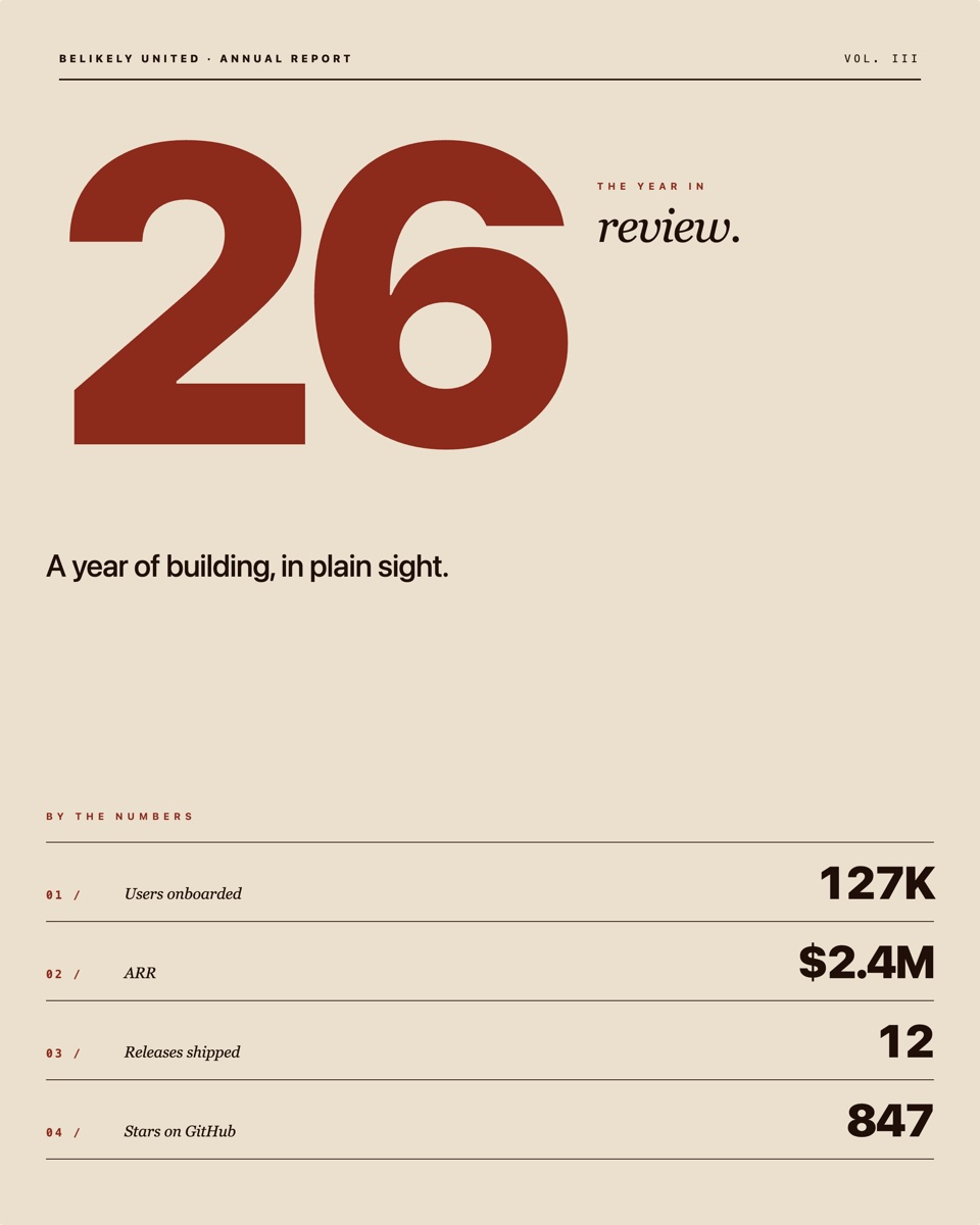
Path. .lerret/marketing/year-review.jsx
export const meta = {
  dimensions: { width: 1200, height: 1500 },
  label: 'Year in review — annual report',
  tags: ['poster', 'recap', 'annual-report'],
  propsSchema: {
    year: { type: 'string', default: '26', required: true },
    company: { type: 'string', default: 'Belikely United' },
    headline: { type: 'string', default: 'A year of building, in plain sight.' },
    stat1: { type: 'string', default: '127K' },
    stat1Label: { type: 'string', default: 'Users onboarded' },
    stat2: { type: 'string', default: '$2.4M' },
    stat2Label: { type: 'string', default: 'ARR' },
    stat3: { type: 'string', default: '12' },
    stat3Label: { type: 'string', default: 'Releases shipped' },
    stat4: { type: 'string', default: '847' },
    stat4Label: { type: 'string', default: 'Stars on GitHub' },
  },
};

// Full source — see the fixture file in the docs repo.
Design notes. No cards, no boxes. The year is the visual; the stats are a typed ledger with border-top rules and large numbers right-aligned. Wine red (#8C2A1B) is the only accent.
15. Pre-launch teaser
Use case. The “coming soon” card you post a few weeks before launch to build hype and capture waitlist signups. Deep oxblood-black background, soft amber bloom centred, gigantic outlined italic word, a rotated date stamp in the corner, italic serif footnote at the bottom. Portrait 1080×1350.
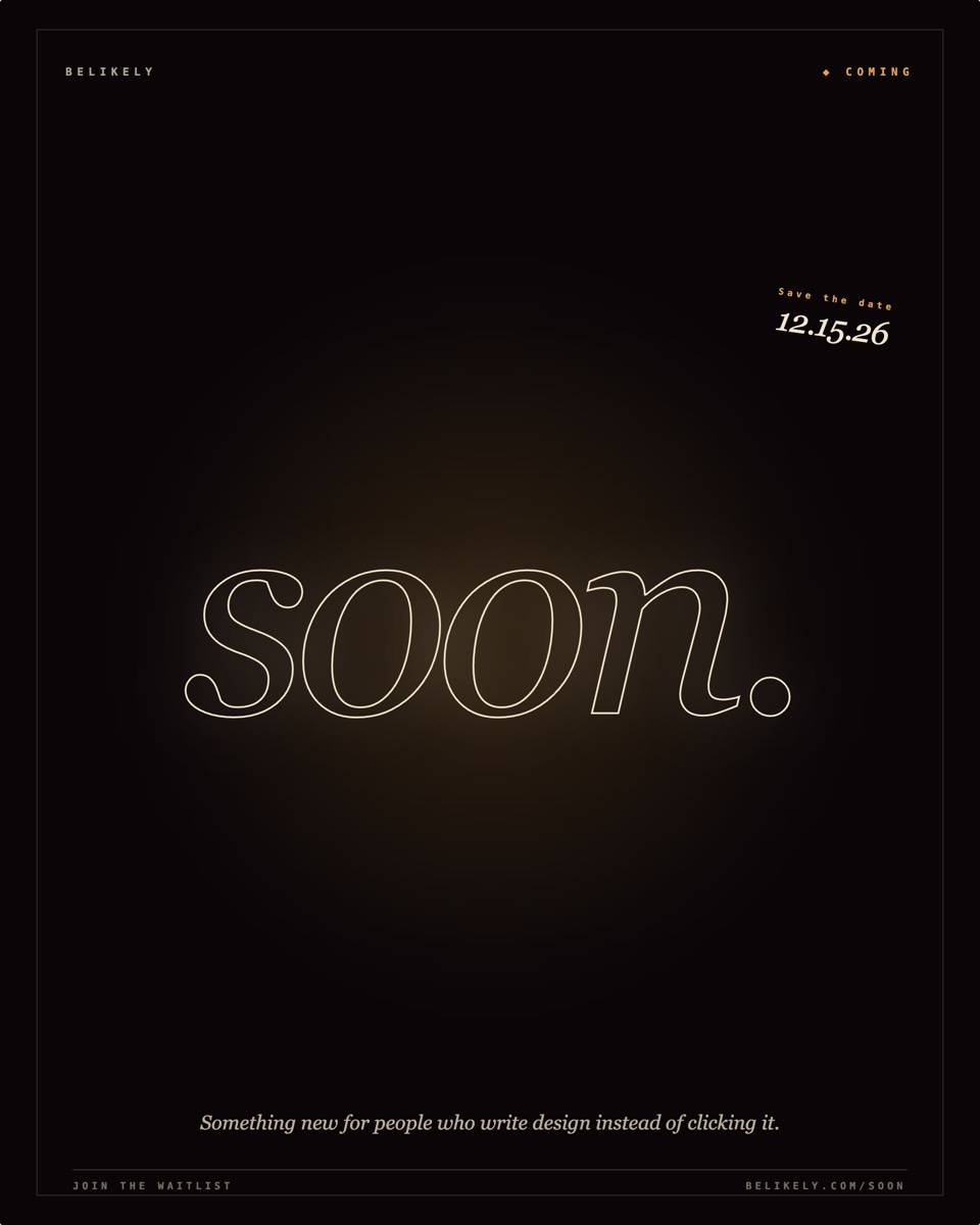
Path. .lerret/marketing/teaser.jsx
export const meta = {
  dimensions: { width: 1080, height: 1350 },
  label: 'Pre-launch teaser',
  tags: ['poster', 'teaser', 'pre-launch'],
  propsSchema: {
    company: { type: 'string', default: 'BELIKELY' },
    word: { type: 'string', default: 'Soon', required: true },
    date: { type: 'string', default: '12.15.26' },
    footnote: { type: 'string', default: 'Something new for people who write design instead of clicking it.' },
  },
};

// Full source — see the fixture file in the docs repo.
Design notes. The single outlined word at 320px is the entire poster — -webkit-text-stroke: 2px + color: transparent so it reads as drawn type. Restraint is the move: don’t reveal the product, just promise the date.
16. Manifesto — statement poster
Use case. When you want to declare something. Black canvas, a pink slash carving the canvas vertically, manifesto-grade statement filling the center, byline in italic serif, monospace filing tag at the bottom. Portrait 1080×1350.
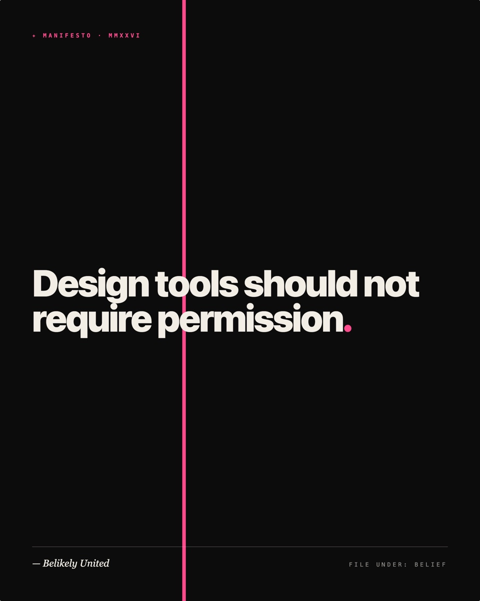
Path. .lerret/marketing/manifesto.jsx
export const meta = {
  dimensions: { width: 1080, height: 1350 },
  label: 'Manifesto / quote poster',
  tags: ['poster', 'manifesto', 'social'],
  propsSchema: {
    statement: { type: 'string', default: 'Design tools should not require permission.', required: true },
    byline: { type: 'string', default: 'Belikely United' },
    date: { type: 'string', default: 'MMXXVI' },
  },
};

// Full source — see the fixture file in the docs repo.
Design notes. Render the statement word-by-word and color only the trailing period in the pink accent. Tiny detail, but it lands like a punctuation mark that makes the line declarative.
Why these patterns
The posters above lean on conventions from print and from app marketing, not from web components. A few techniques that translate especially well via plain React + inline styles:
- CSS-rendered device frames → no PNG mockup needed. An iPhone is a rounded rectangle + inner padding + a dynamic-island pill + a status bar. A laptop is a trapezoidal base + a rounded inner screen. Both render crisply at any scale via the export pipeline.
-webkit-text-stroke+color: transparent→ outlined display type without an SVG. Survives every Chromium export.transform: rotate()on text blocks → editorial diagonals, rubber-stamp angles, vertical book-spine text.- Solid color blocks (
background, no gradient) → screen-printed flat-color feel. - Numbered ledger rows → editorial gridding without box-card UI patterns. Each row is a
border-bottom; indices live in monospace. - Mixed serif + sans + monospace → masthead grids almost always need all three. System default Georgia + system-ui sans + ui-monospace gets you 90% of the way without webfont overhead.
What’s next
- Authoring Assets —
meta,propsSchema, data files, fonts, variants. - Concepts — pages, groups, variants, the four-tier prop cascade.
- CLI Reference —
@lerret/cli devto render the canvas,@lerret/cli exportto capture every artboard headlessly.
Got a poster pattern that should be here? Open a Discussion — community-contributed examples land in a future expanded gallery.